Slasher: poster design
For the 2014-15 season's annual Halloween-related show, the Hippodrome produced Slasher, a campy, weird, and spectacularly bloody parody of Hollywood horror movies and a surprisingly insightful exploration of the portrayal of women in horror films. I thought it would be fun to take the stereotypes of women in horror and exaggerate them as much as possible for the poster, so I created a collage of women from the covers of actual pulp mystery and horror novels. This monstrous visual spills from the head of one girl, the "final girl," Slasher's main character and perhaps the most prevalent horror movie stereotype of them all.
Slasher: digital design
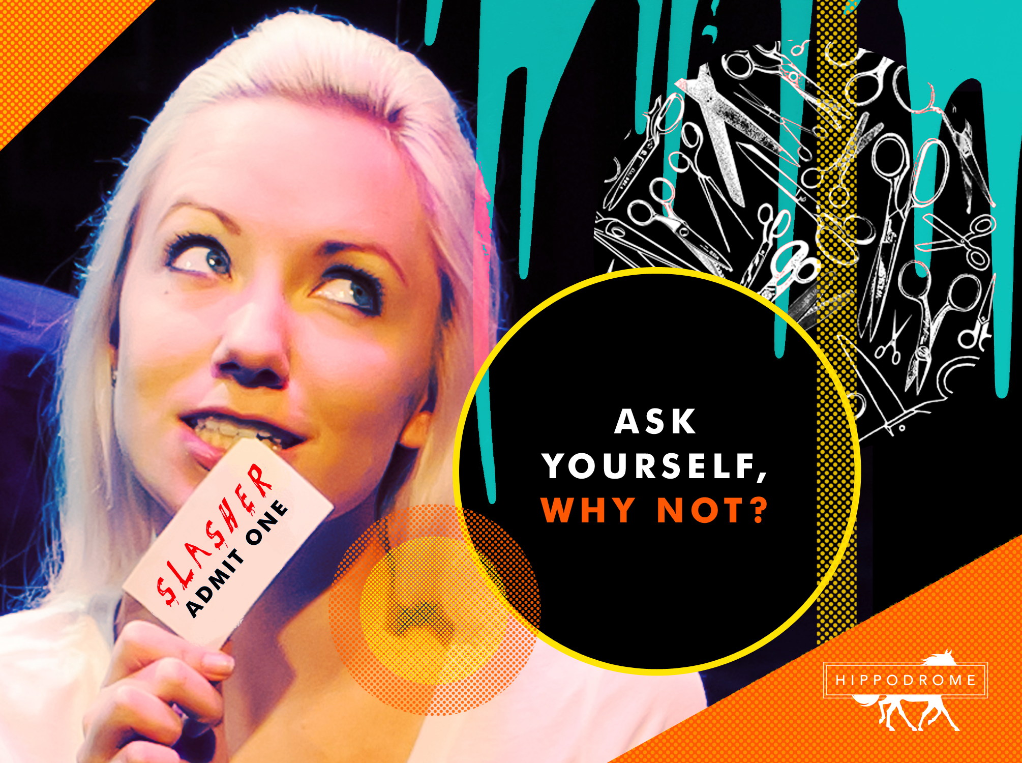
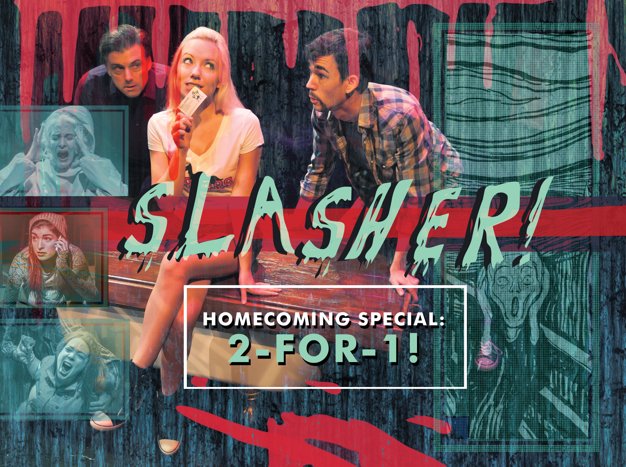
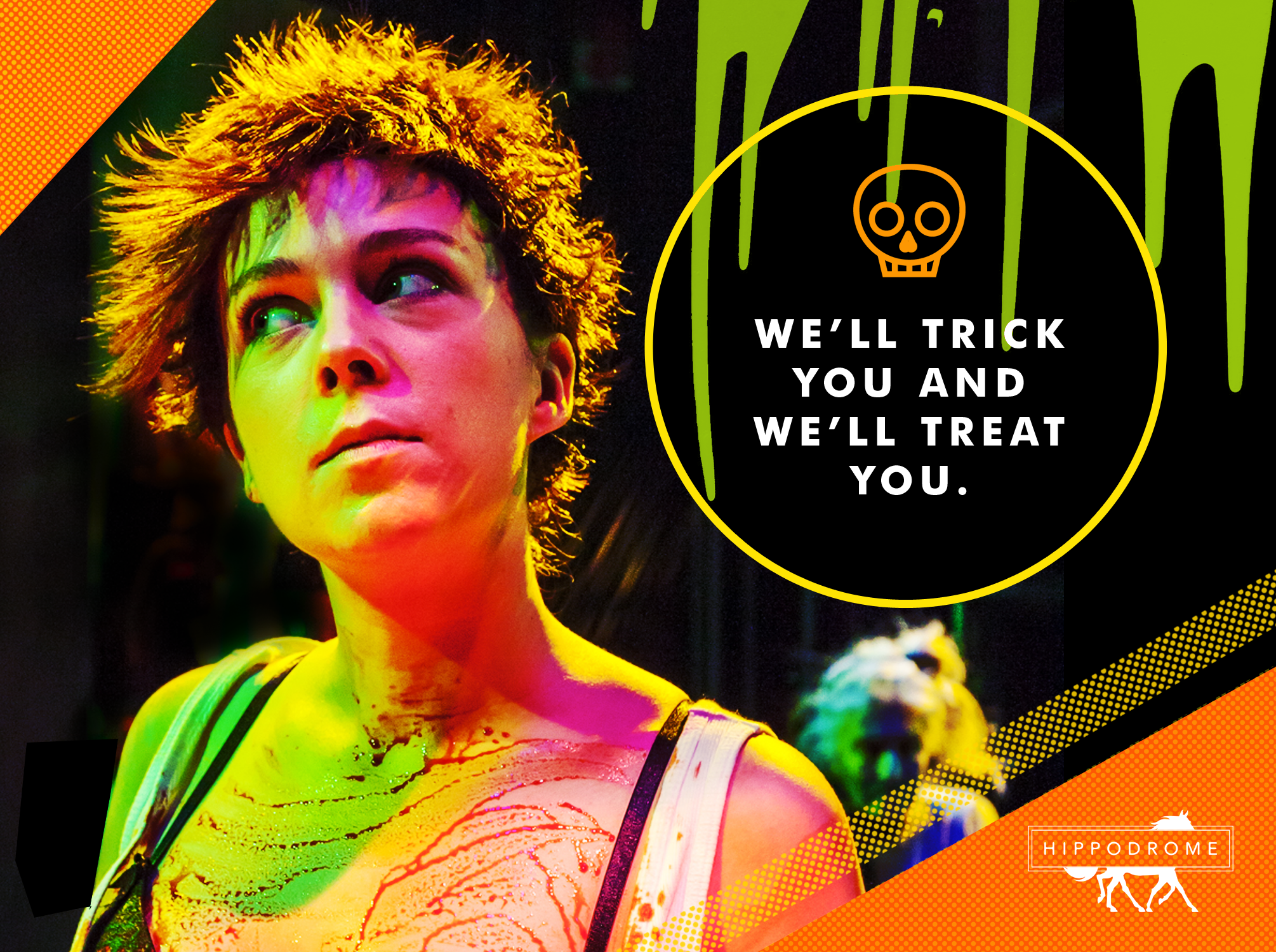
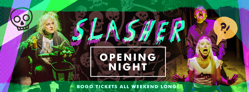
Below are a few examples of graphics I created for e-mail and social media campaigns during the run of Slasher. The challenge was to create images that would come across as campy, fun, and a little bit eery all at once, so jarring colors and playful imagery were key.


